Overview
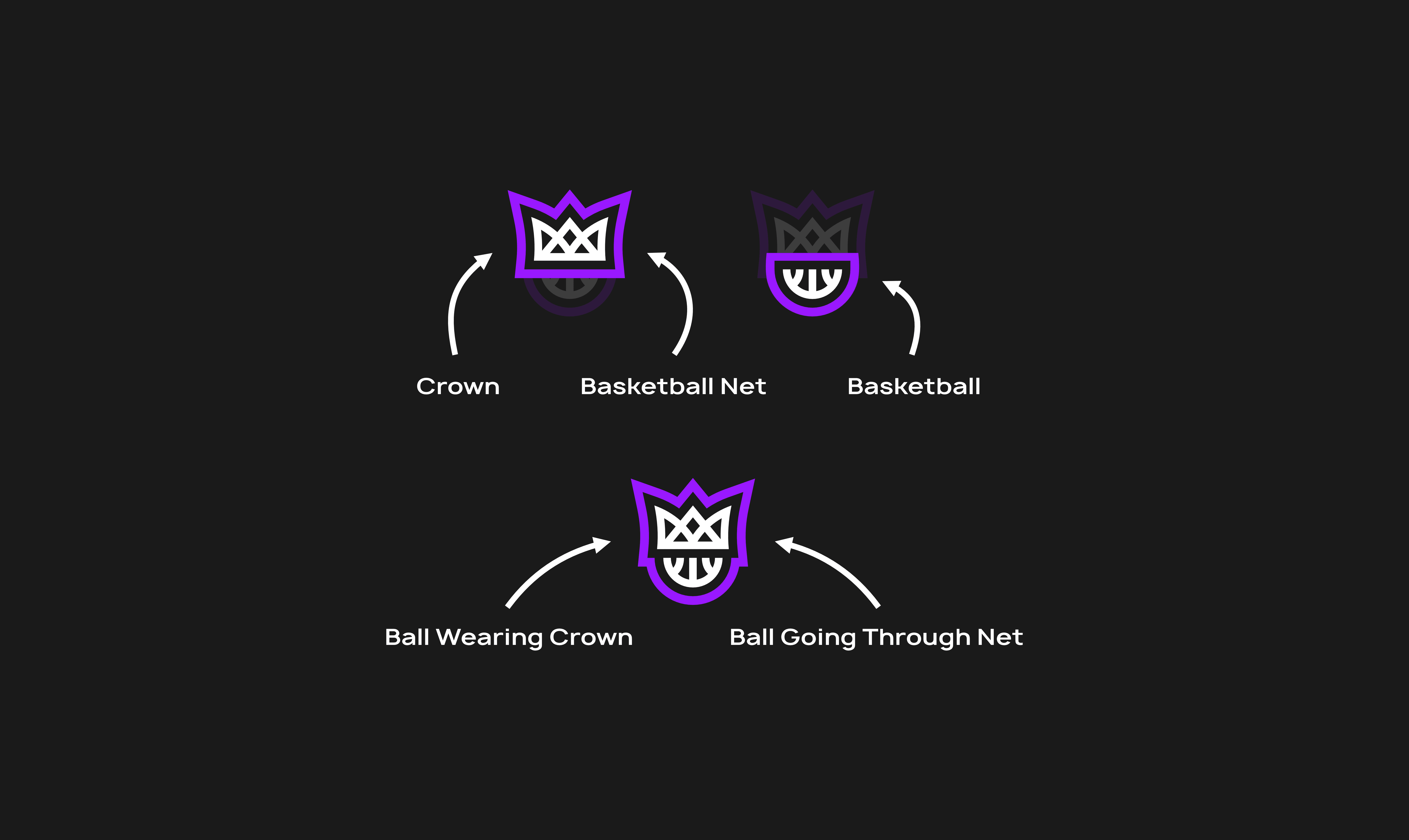
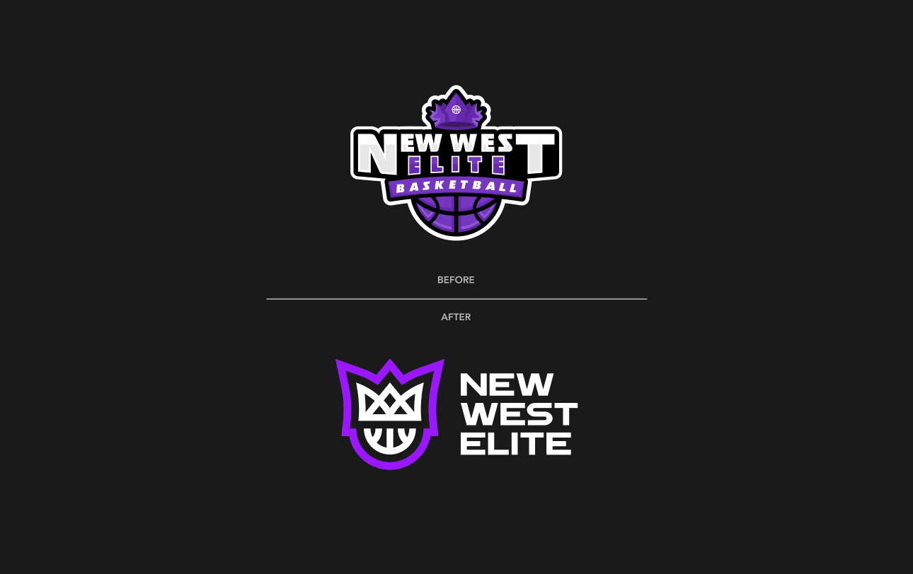
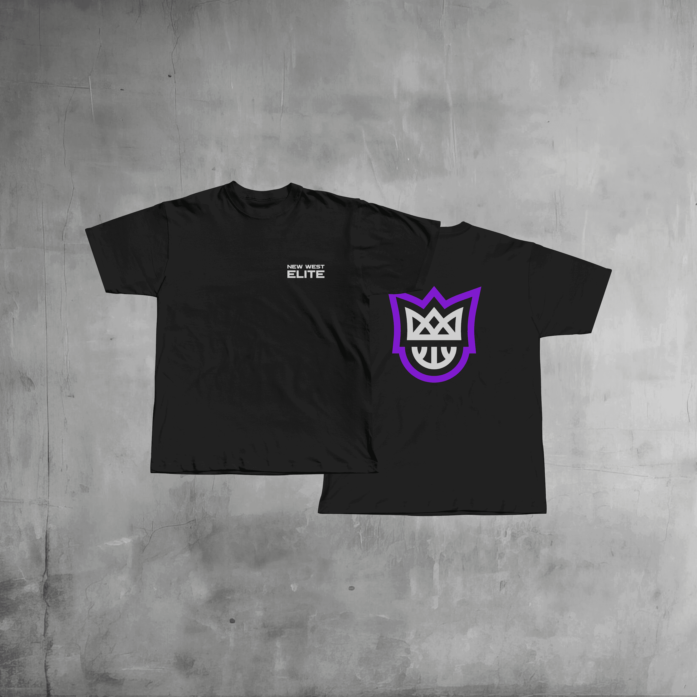
New West Elite was rapidly improving their presence in the community, but their visual identity lacked the strong, fast, and versatile feel for a sports team. By using bolder colours and sharper lines, the updated mark brings a new energy to the brand and the city.
The previous logo was way too intricate for its intended use - it included six different shades of purple, and the crown had nine separate points. This made it difficult and expensive to use on clothing, uniforms, flyers, and social media.
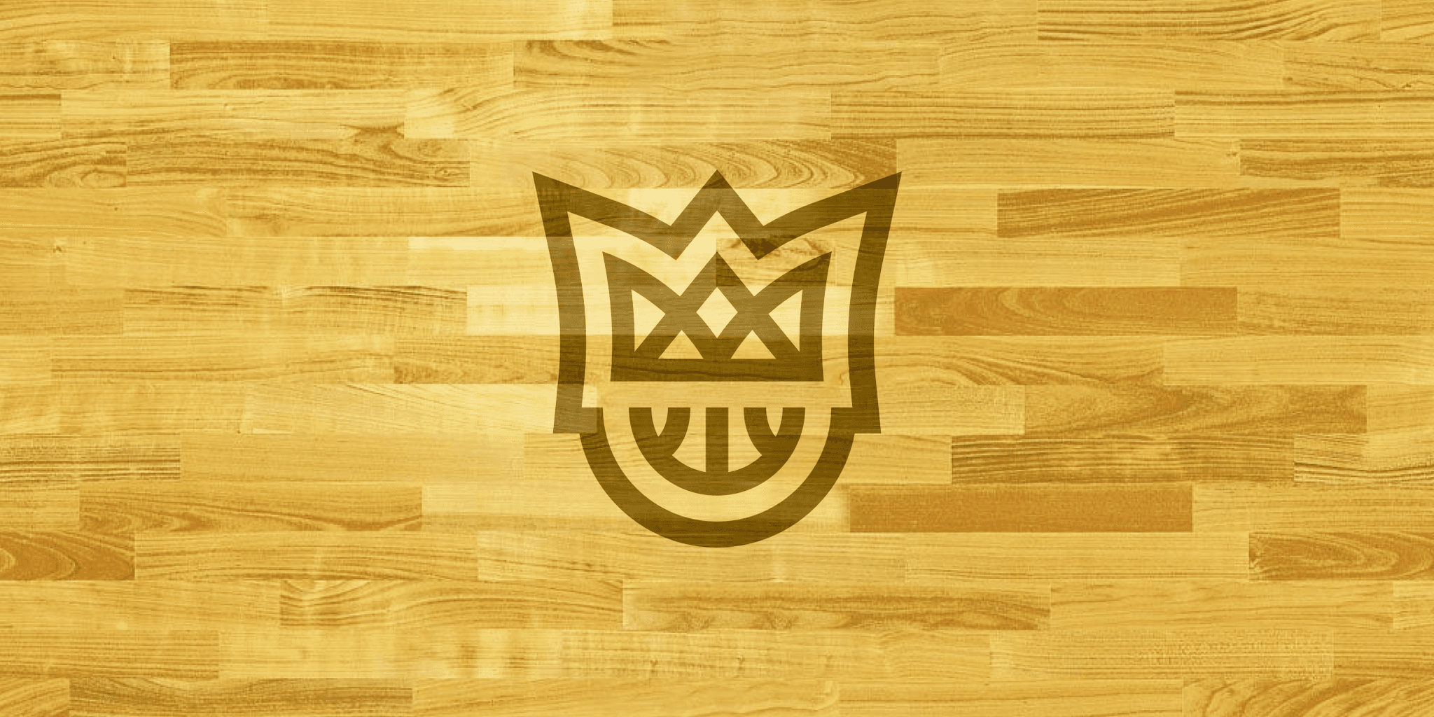
A geometric mark that tells a story with simple lines and colours, making New West Elite feel more like a high-level sports team.